how i find the purple boxes on my charts
Markets spend the vast majority of their time compressing sideways before they finally explode into a real trend.
If you want to catch these explosive moves early, you have to find where institutional energy is coiling up.
I built an automated tool that draws a clean box on your chart the exact moment a stock or index enters this tight compression phase.
It is called the BreakerBox+ Indicator.
Instead of manually plotting zones and trying to decide where the range actually ends, this algorithm instantly identifies the tightest ranges on any chart.
The real key lies in how it grades these setups so you can focus only on the absolute best opportunities.
It automatically divides every consolidation range into four clear quality tiers: Prime, High, Mid, and Low.
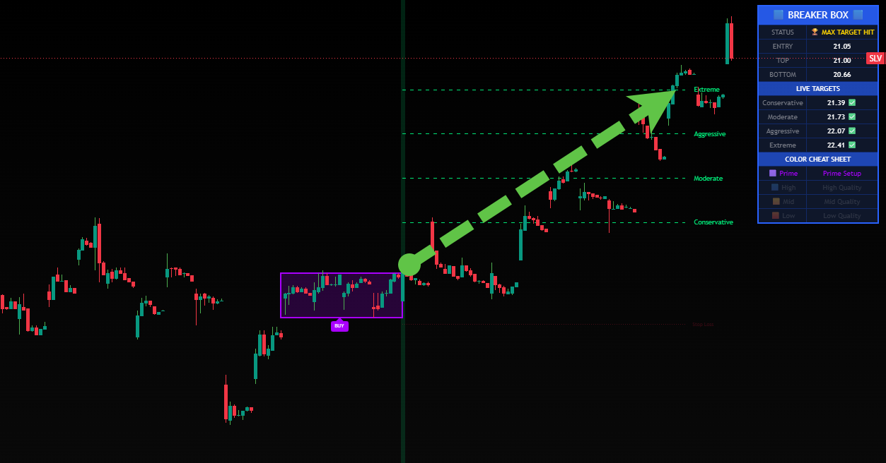
Prime setups are painted purple on your chart, signaling maximum compression and the highest probability of an explosive breakout.
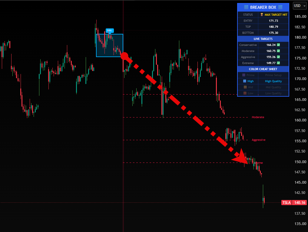
High-quality setups are painted blue, giving you another incredibly strong base to trade.
Once the price breaks out of the box, the indicator automatically projects your exact take-profit targets based on the size of the consolidation.
You can use this exact system on stocks, futures, crypto, or forex.
I wanted to make this as direct and simple as possible for you to start using today.
You can grab your access to the complete indicator package right now.
Get the BreakerBox+ Indicator Now
Stop trying to manually hunt down these breakout zones on your own.
Let the software do the heavy lifting so you can focus on executing the trades.
Talk soon,
Ben
Find Better Trades
P.S. If you want to see how this indicator plots live targets in real-time, click the link below to see the full walk-through on our page.